Newcomers in Canada often find it difficult to access accurate information and resources. The SettleCAN mobile app would allow people to settle in Canada with guidance and ease by providing users with accurate and up-to-date information - from what to do when they first arrive in Canada to things to do during their settling-in process. The app prioritizes straightforward user flows and collaborative opportunities to cater to people who like getting their information from one place and staying organized.
Due to the lack of awareness and accessibility of accurate and reliable resources, newcomers are often steered on the wrong path as they rely on following information provided in public forums, which are subjective or lack up-to-date information.
Nunc ac arcu erat. In volutpat ornare massa non condimentum. Praesent lacinia interdum mi sit amet volutpat. Integer suscipit orci vel fringilla hendrerit. Nunc ac arcu erat. In volutpat ornare massa non condimentum. Praesent lacinia interdum mi sit amet volutpat. Integer suscipit orci vel fringilla hendrerit. Nunc ac arcu erat.
Nunc ac arcu erat. In volutpat ornare massa non condimentum. Praesent lacinia interdum mi sit amet volutpat. Integer suscipit orci vel fringilla hendrerit. Nunc ac arcu erat. In volutpat ornare massa non condimentum. Praesent lacinia interdum mi sit amet volutpat. Integer suscipit orci vel fringilla hendrerit. Nunc ac arcu erat.
Newcomers in Canada often find it difficult to access accurate information and resources. The SettleCAN mobile app would allow people to settle in Canada with guidance and ease by providing users with accurate and up-to-date information - from what to do when they first arrive in Canada to things to do during their settling-in process. The app prioritizes straightforward user flows and collaborative opportunities to cater to people who like getting their information from one place and staying organized.
Due to the lack of awareness and accessibility of accurate and reliable resources, newcomers are often steered on the wrong path as they rely on following information provided in public forums, which are subjective or lack up-to-date information.

I collaborated with multiple stakeholders at Solid Ventures Inc. to define their business objectives, ensuring alignment with both user and business requirements. After thorough discussions, I summarized these objectives into three key business goals:

My goal for the project was to design an app that would allow newcomers find all information they need in one place rather than navigating through multiple sites. I wanted to create a tool that prioritizes a straightforward user flow and promotes an inclusive user experience.
To begin my research process, I explored articles and websites that provided background information about sustainable responsibility and the current single-use plastic waste situation, which was when I discovered an eye-opening statistic from "The Elusive Green Consumer", an article written by Katherine White, David J. Hardisty, and Rishad Habib:
To get a sense of the current market, I analyzed 4 popular websites that sell eco-friendly and sustainable products. The main purpose of the audit was to understand the competition and find areas for improvement.
In addition to the competitive analysis, i found it imperative to gain insights from users to determine Areka's target audience. I conducted an online survey, which gathered 49 responses, to understand the users' thoughts about sustainability and existing websites selling eco-friendly products.
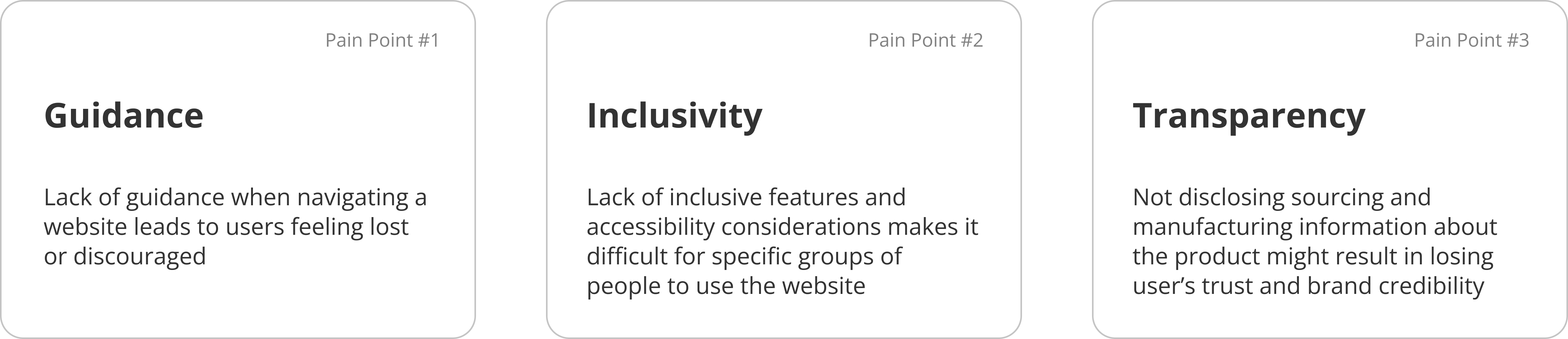
Based on the insights gathered through the background research, competitive analysis, and surveys, I deduced vital pain points users experienced on eco-friendly branded websites.
I will focus on addressing the following pain points when designing Areka's user experience:
To begin my ideation phase, I outlined 4 major goals that would serve as a guideline throughout the design process. The main purpose of this exercise was to ensure that I addressed the user pain points in the most effective way possible.

The main objective I had when developing Areka's user flows was to make it easy for users to complete a task without being overwhelmed with too many options and pages to navigate, using Hick's Law as a guiding principle to create the most efficient user flows. This led me to organize Areka's user flows into two main categories: Browsing & Purchase and Curate.
To ensure that users don't feel overwhelmed with browsing and purchasing a product, the user flow follows a simple and familiar structure that efficiently incorporates all the necessary steps to give users more time for decision making.
An additional feature incorporated within the user flow is the inclusion of the "Feature", "Process", and "After Use" categories under Product Details to address the user pain point of Transparency. Providing adequate information about the product would allow users to feel the brand's genuineness and be more inclined to revisit the website.
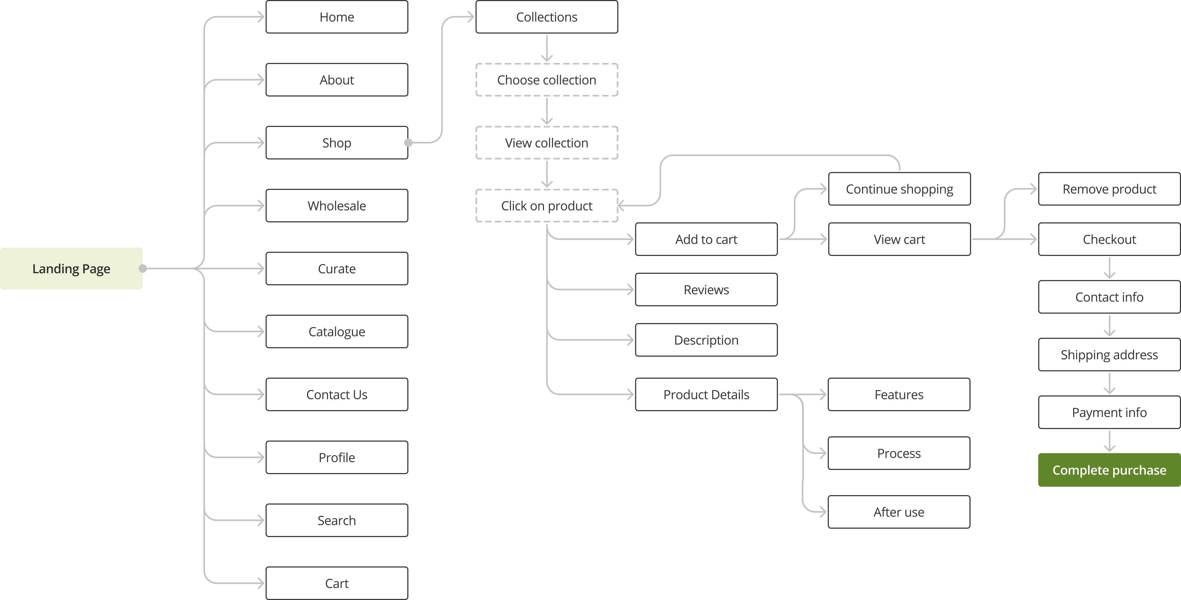
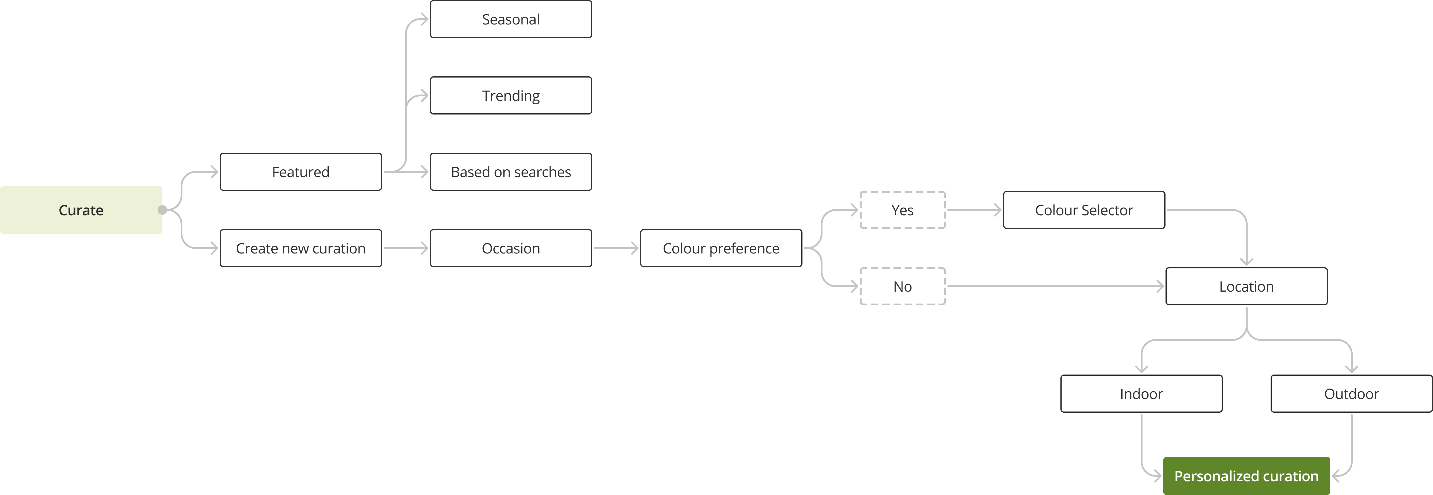
To address the user pain point of Guidance, I developed the Curate feature to provide users with personalized recommendations based on their current needs. This would make it easier for users who are undecided about a product or want additional help with their decision-making process.
Users can choose from two options, curating their product recommendations or browsing featured products based on insights collected from trending searches, user activity and seasonal interests.
The initial designs for Areka's responsive website focused on incorporating 4 main goals previously outlined to deliver a personalized experience for users who wish to learn more about eco-friendly dinnerware as they purchase it. I divided the wireframes into four underlying typologies: Home, Curate, Product, and Checkout.
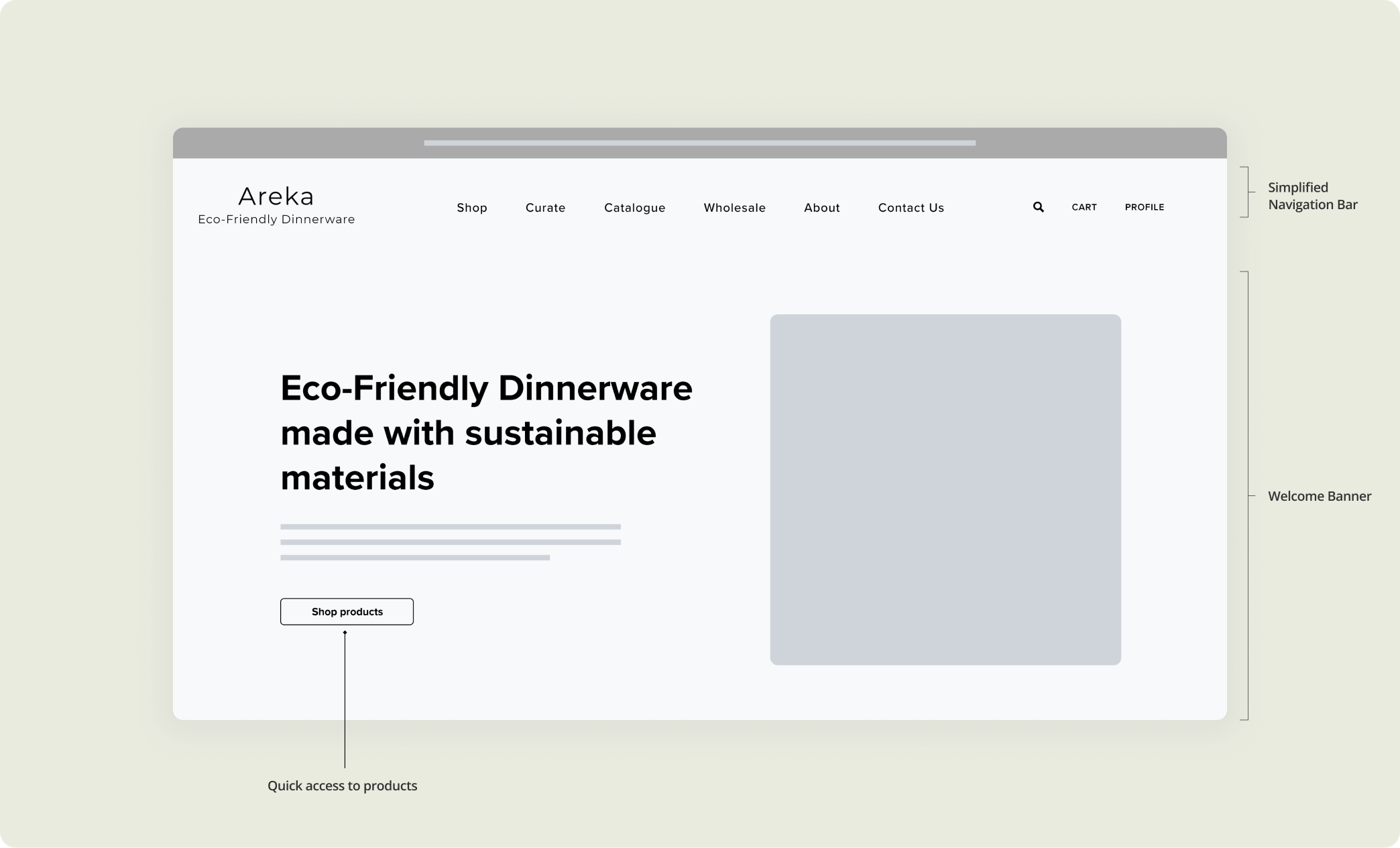
For the Home screen, I distilled a simplified layout with a hero banner and a top navigation bar to highlight the fundamental aspect of the website - to shop for products. This layout would allow users to access the page they need quickly and easily without navigating through multiple pages.
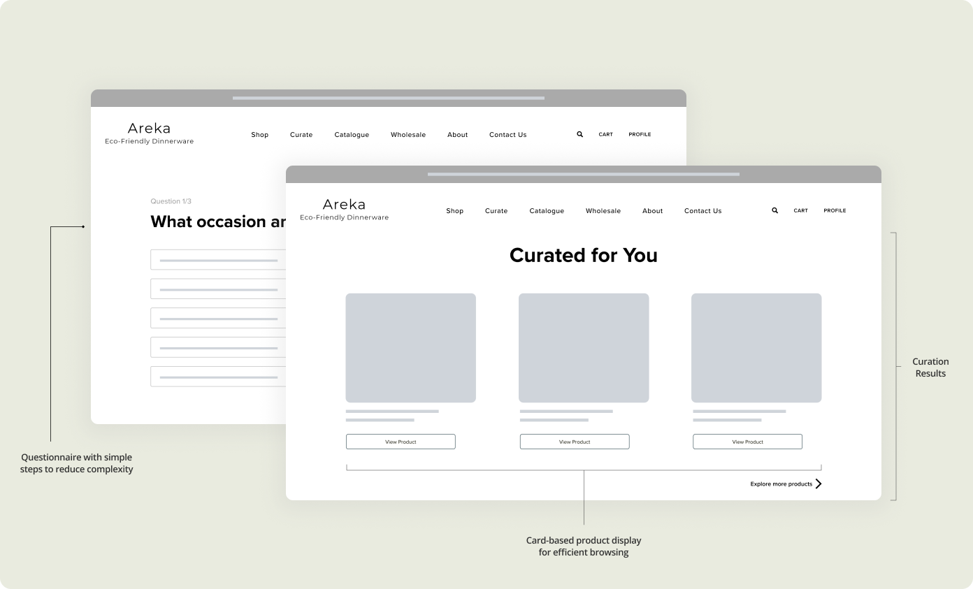
Another essential and unique feature of the website is the addition of a Curate page, a feature that would allow users to curate a personalized collection of products based on their needs and interests. The curation is completed in small, simple steps to avoid overwhelming the users with multiple options.
The Product pages' primary function is to be transparent with the product details to increase user engagement. Emphasizing the image carousel and product info section by placing them in the center of the page will allow users to focus on the product rather than get distracted while making a decision.

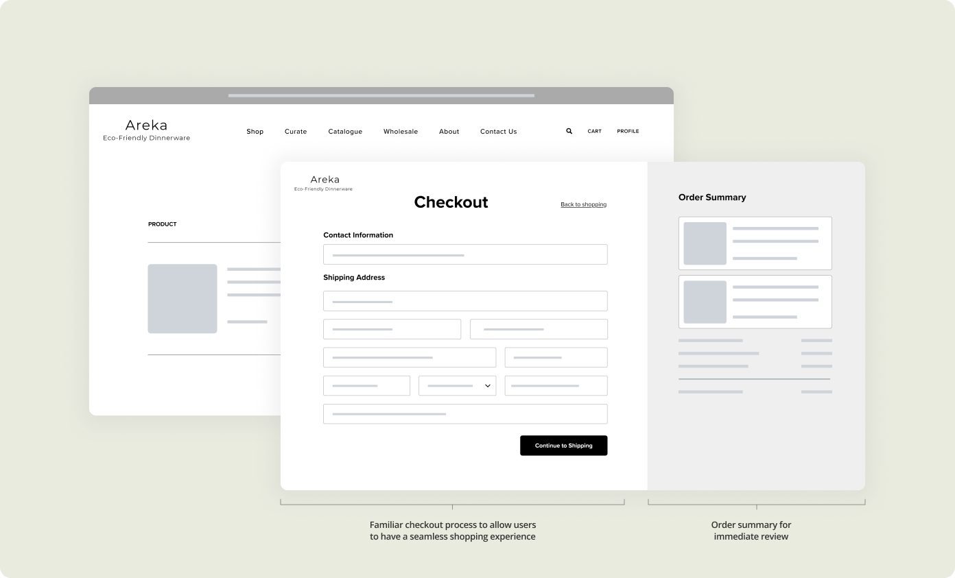
While drafting Areka's checkout experience, I placed an emphasis on familiarity and efficiency. I used existing checkout models to let users focus on completing their purchases rather than learning how to move onto the next step.
For Areka's branding, I focused on creating an identity that reflected the business' sustainability goals and bringing an in-person shopping experience to home. I incorporated both business and user needs to establish the business' design and branding strategies and create a sophisticated, polished end-product.
The goal of the logo was to incoporate the areca palm leaf into the design to highlight the material from which most of the products are made.
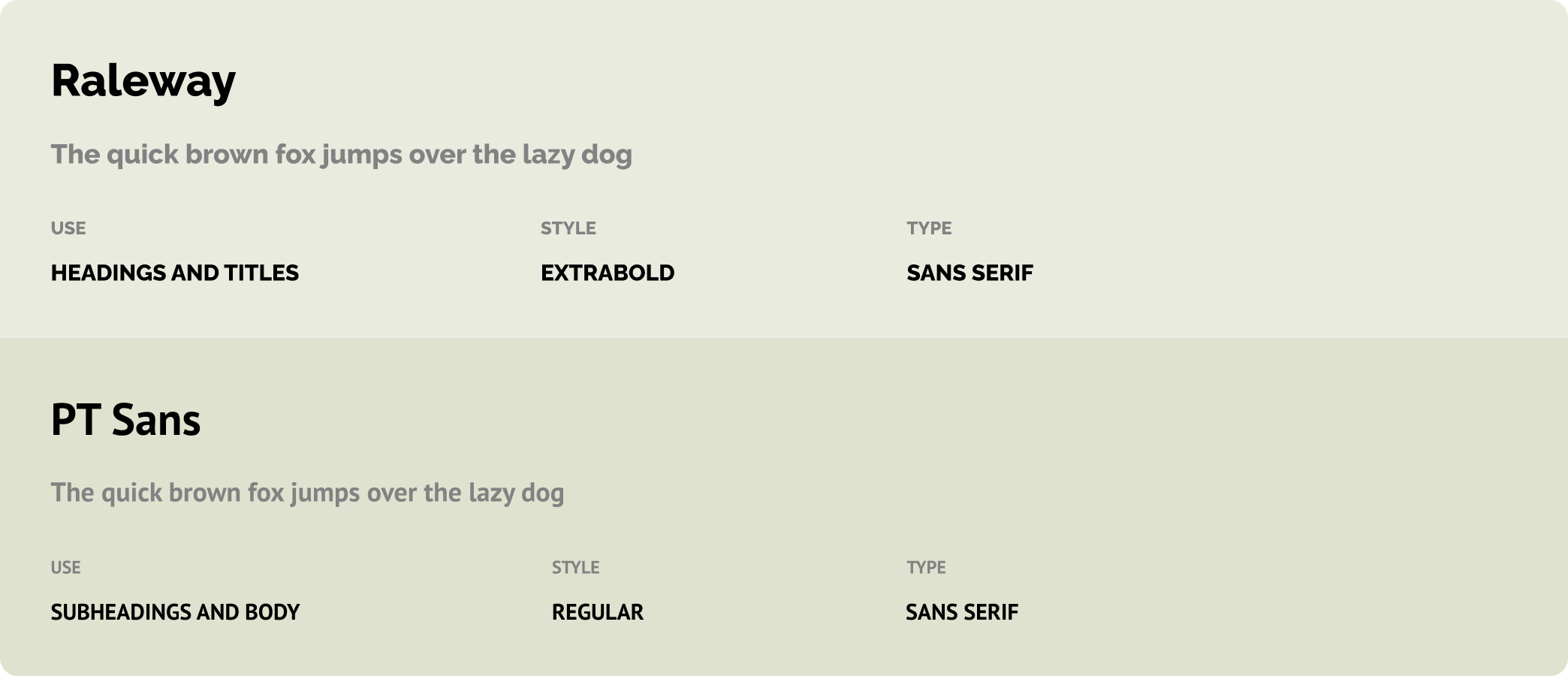
My choice of typeface for headings and titles was that of something elegant and geometric to stand out to users. For the subheadings and body text, I chose to use a typeface that combines traditional and modern styles while maintaining enhanced legibility to add a bit of character and refinement.
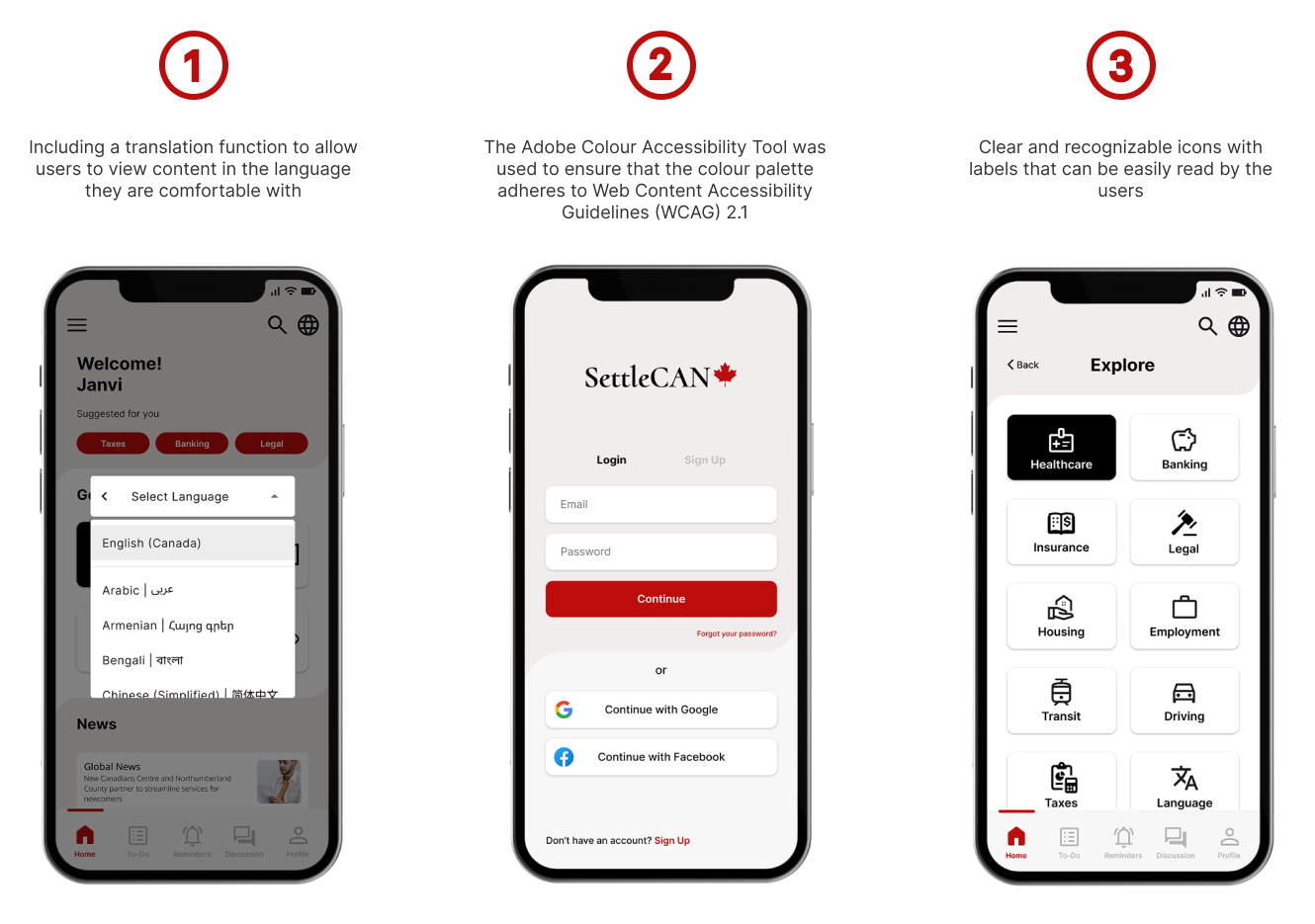
Areka's colour palette was predominantly inspired by the aesthetic of the tropical forests from where the areca palm leaves are sourced. To maximize accessibility and usability, I used the Adobe Colour Accessibility Tool to ensure I adhered to accessibility guidelines to create a colour palette that is both user-friendly and visually appealing.

During the final stage of the design process, my main goal was to implement the branding strategies previously outlined within the drafted wireframes to create high-fidelity mock-ups for the responsive website. I emphasized developing a clean and sophisticated website that allowed users to browse for products and learn about sustainability simultaneously in order to address business and user needs effectively.
.png)
The mobile version of the website simplifies the features to avoid overwhelming the users with content and provides a clean user interface for users to browse through products easily.
.png)
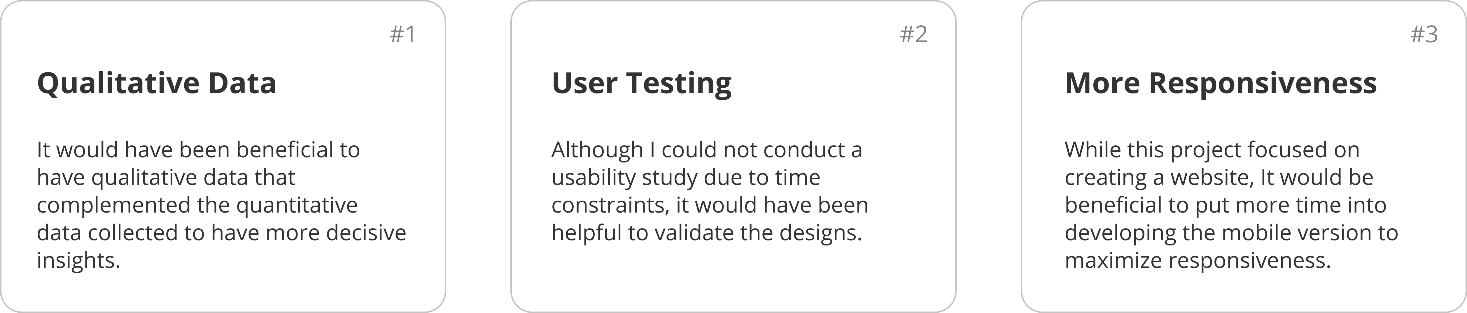
As this was my first ever freelance project, I was immensely grateful to have the opportunity to collaborate with various stakeholders to develop a responsive website, end-to-end. Throughout this design process, it was interesting to realize that so many design considerations need to taken into account for any given design solution, even for simple user experiences.
Newcomers in Canada often find it difficult to access accurate information and resources. The SettleCAN mobile app would allow people to settle in Canada with guidance and ease by providing users with accurate and up-to-date information - from what to do when they first arrive in Canada to things to do during their settling-in process. The app prioritizes straightforward user flows and collaborative opportunities to cater to people who like getting their information from one place and staying organized.
UX Designer — Research, Information Architecture, Usability Testing, Wireframing & Prototyping
Due to the lack of awareness and accessibility of accurate and reliable resources, newcomers are often steered on the wrong path as they rely on following information provided in public forums, which are subjective or lack up-to-date information.

My goal for the project was to design an app that would allow newcomers find all information they need in one place rather than navigating through multiple sites. I wanted to create a tool that prioritizes a straightforward user flow and promotes an inclusive user experience.
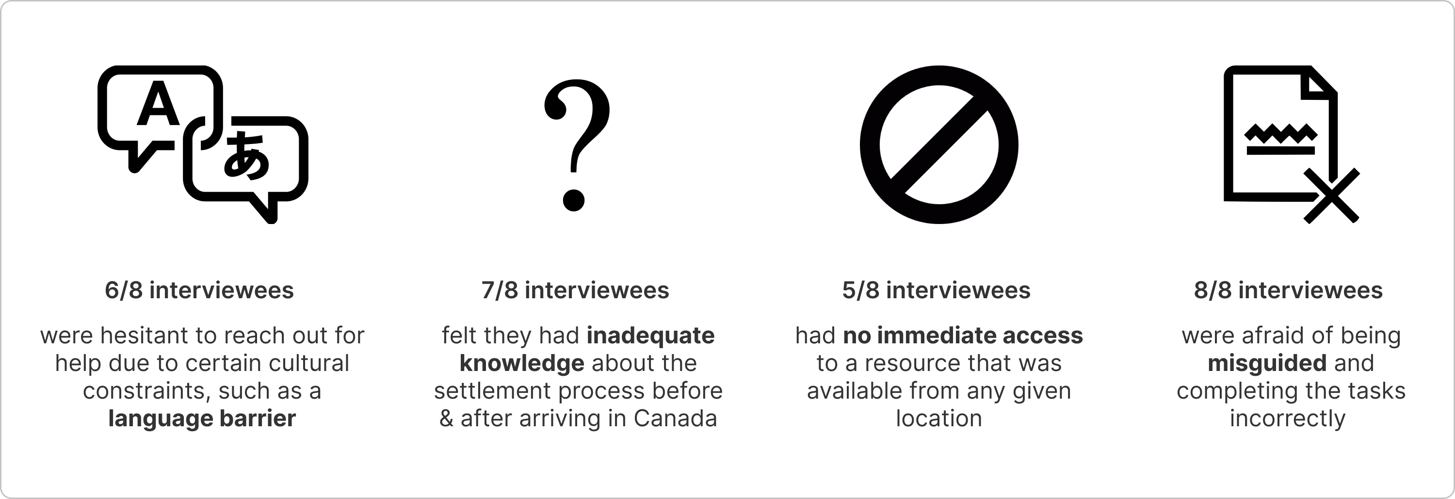
Starting with qualitative research, I interviewed 8 people who had recently immigrated to Canada are in the midst of settling in. The goal was to identify the challenges newcomers faced during their settlement process.
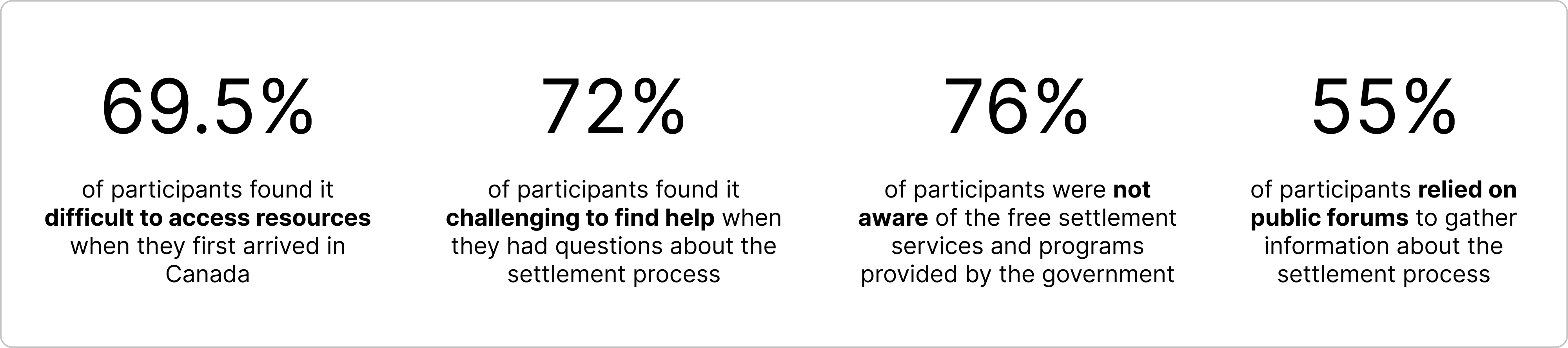
For quantitative research, I conducted an online survey using Google Forms to understand how newcomers experienced their settling-in process in Canada and to observe any patterns between them. The survey gathered a total of 45 responses which assisted me in identifying distinguishable insights into the problem.
In addition to the qualitative and quantitative research, I conducted a competitive audit that analyzed 3 of the most well-known online resources currently available for newcomers in Canada.
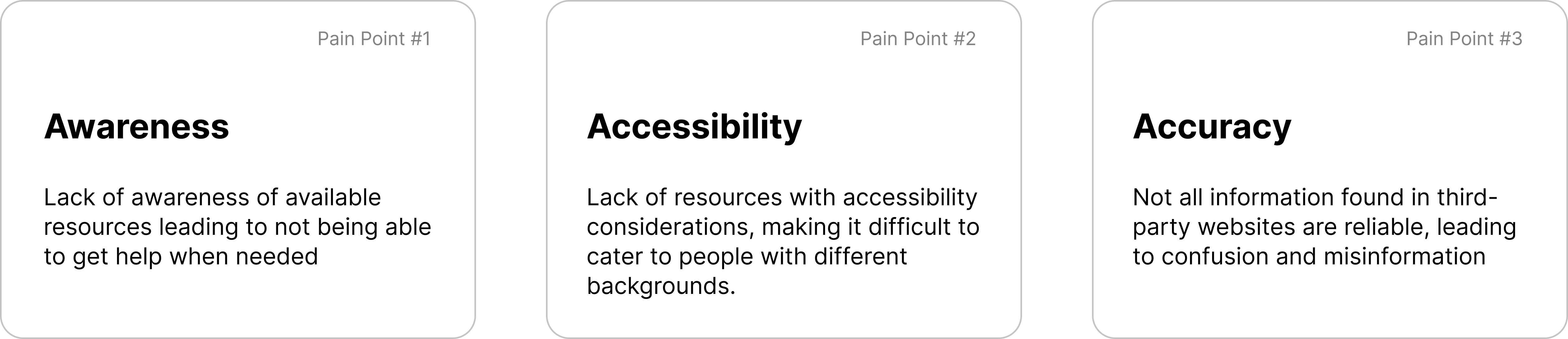
By combining the insights gathered from the interviews, surveys, and competitive audit, Iwas able to deduce key pain points that users experienced while searching for newcomer-related online resources.
I will address the following pain points when designing SettleCAN's user experience:
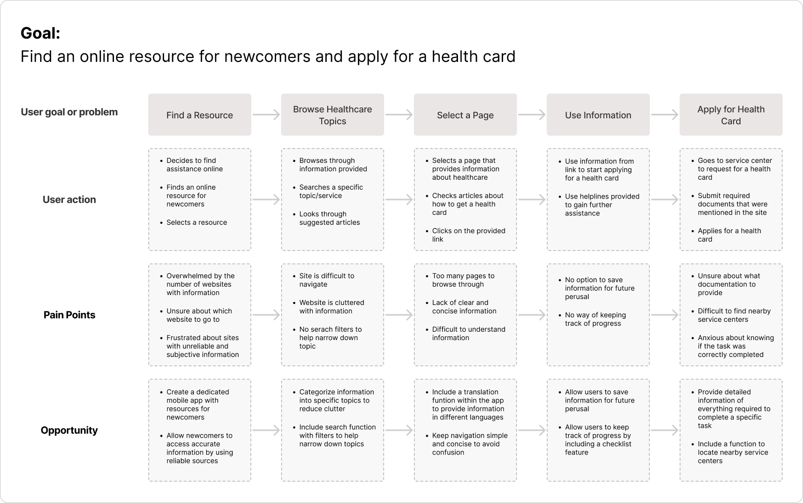
Based on the research conducted, I created a user journey map to help understand the pain points and emotions that a user might feel while searching for an online resource as a newcomer. The visual representation of the user's journey also highlights improvement opportunities, which will be applied when iterating designs for the mobile app.
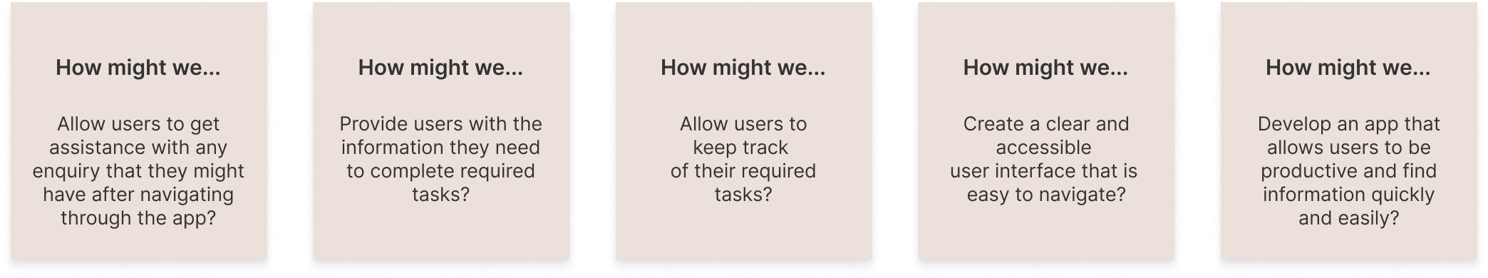
I developed a few How Might We statements to begin my ideation process and explore ideas that might help solve the outlined user problems. I aimesd to translate the gained insights into actionable design solutions and work on reframing user pain points into valuable opportunities.
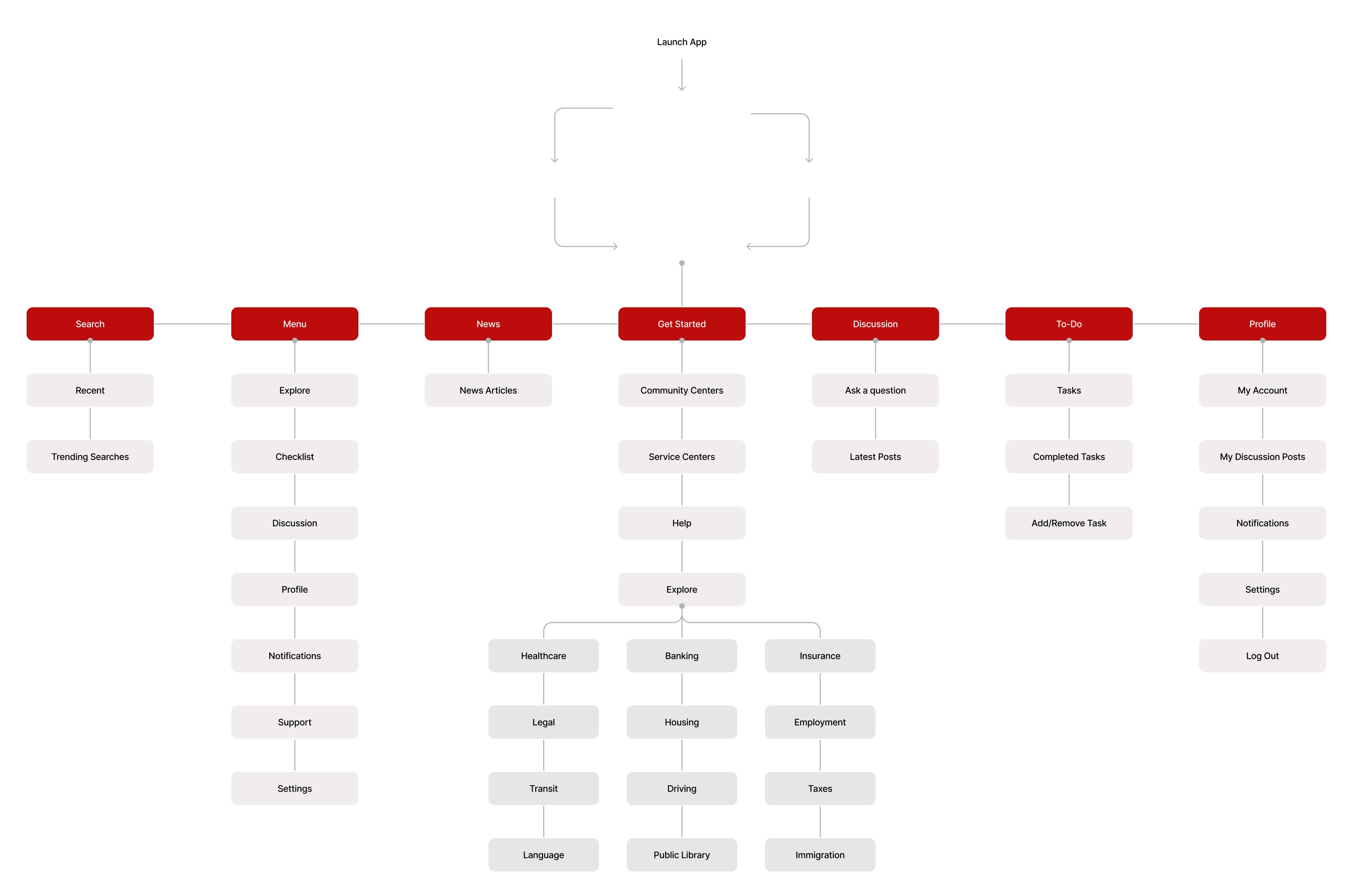
My goal when developing the app's information architecture was to prioritize seamless and efficient user navigation. This was done so to ensure that users can focus on completing their tasks rather than trying to figure out how the app works.
Keeping the user pain points, awareness, accessibility and accuracy, in mind, I started creating paper wireframes to begin sketching out potential screen designs. I prioritized a clear and straightforward navigation process to ensure users are comfortable with the process and avoid confusion.
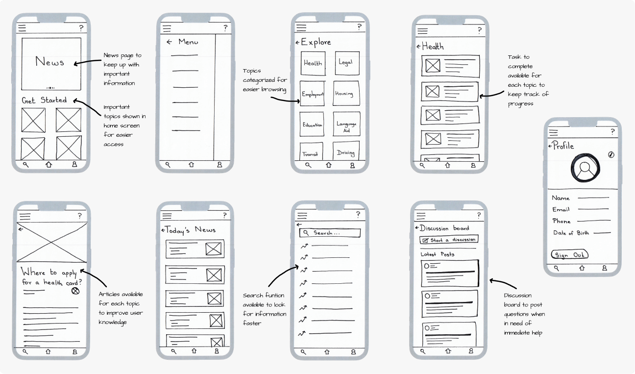
When creating the digital wireframes for the SettleCAN app, easy navigation was an essential user need toaddress in the designs inaddition to allowing users tokeep track of their settlement process.
I categorized the wireframes into 3 main groups based on their primary functions: Home and Browsing, Online Resources, and Progress Tracking.
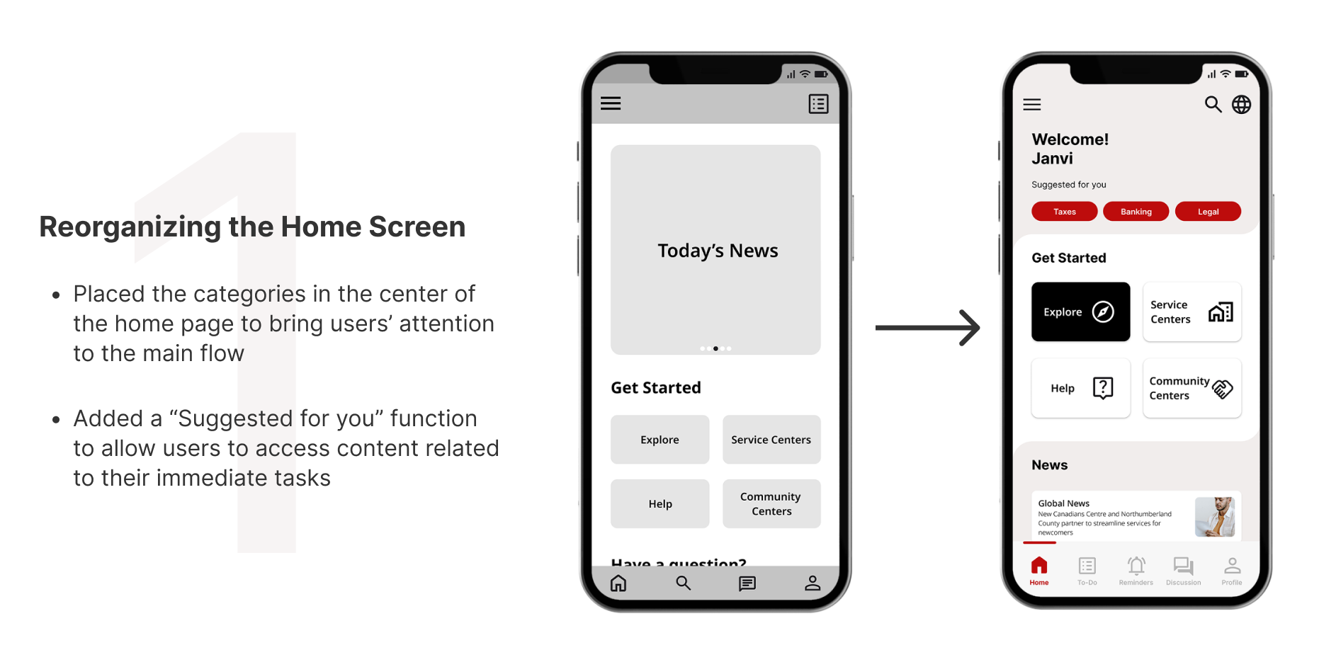
My main focus when designing the home and browsing screens was to keep them simple and easy for the users to understand. To avoid any navigational difficulty, the content was categorized into major topic to assist users with finding information they needed quickly and easily.

Features such as a news page and informative articles were included to prevent users from feeling like they have inadequate knowledge about the settlement process. This would allow users to find all the information in one place rather than searching through multiple sites.
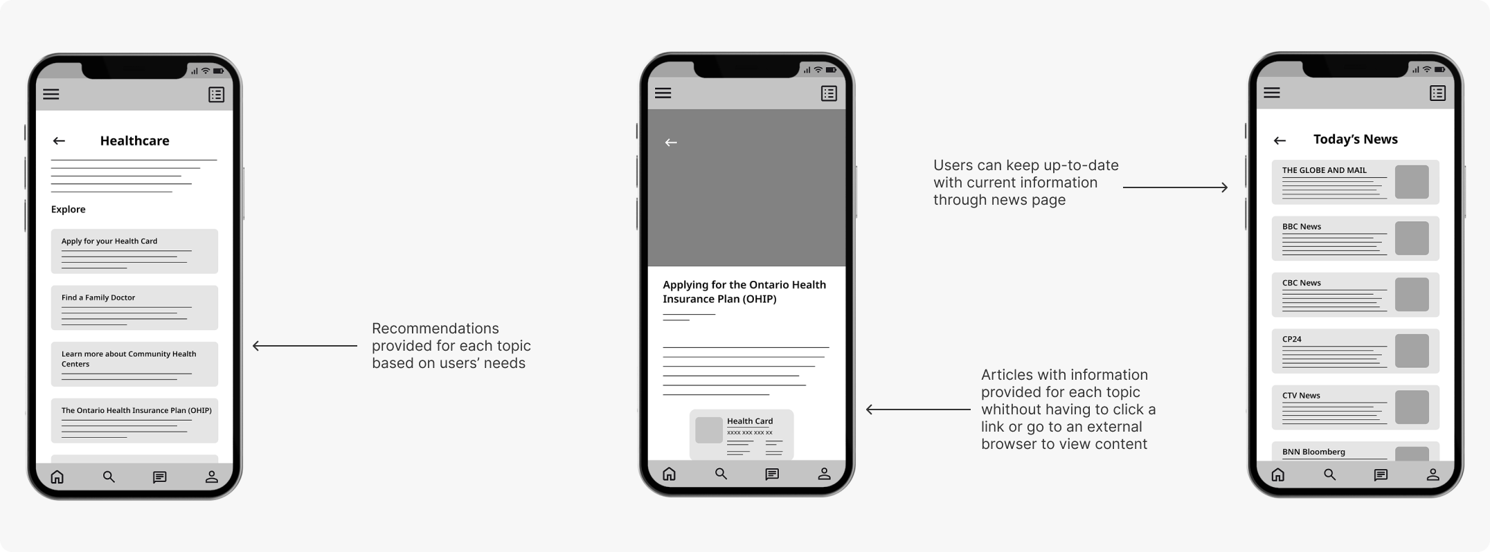
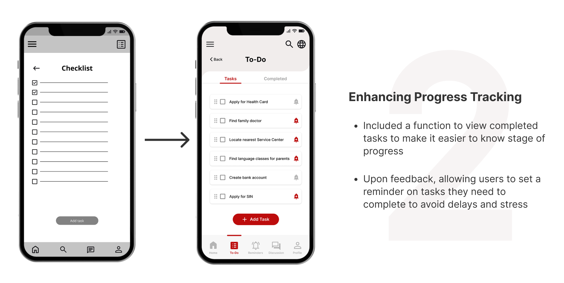
A checklist function was introduced to optimize user efficiency and allow users to track their settlement process. Additionally, including a discussion board and a search function would allow users to find answers to their enquiries while completed required tasks.
To prepare for usability testing, I created a low-fidelity prototype using the digital wireframes to construct a user flow that emphasized the browsing of topics to adding a task to an existing checklist.

After conducting the usability study, I created an Affinity Map to help analyze the data collected. I organized the findings under specific topics to better understand the user insights as well as recognize & prioritize user pain points for future iterations.
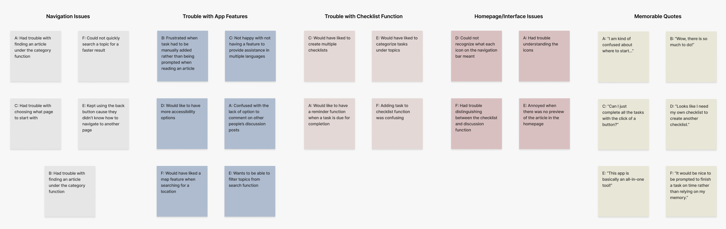
Here are the key observations derived from the usability study:
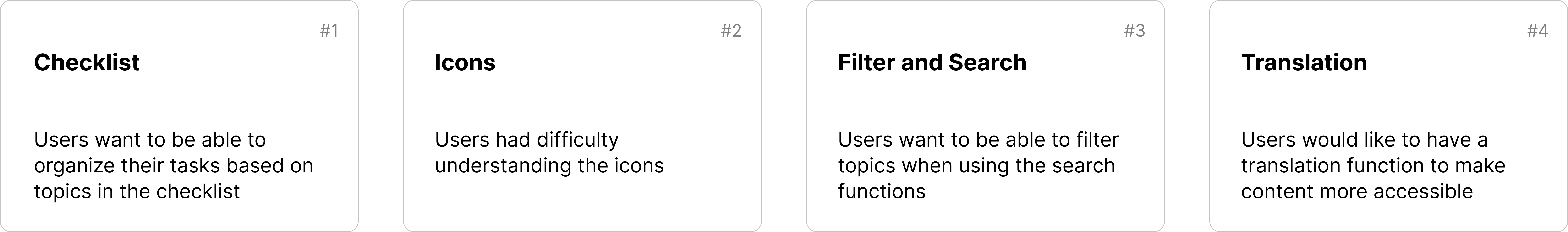
Taking into consideration the feedback gathered from the usability study, I refined the designs to address the insights collected and enhance the overall user experience of the app.

Throughout my design process, my focus was always on designing an app that EVERYONE could use. I included features such as a translation function, recognizable icons, and a neutral colour palette to maximize usability and accessibility.
Based on the feedback gathered during the usability study, I reiterated the designs of the final screens to bring focus to certain features and improve the app's overall user flow.
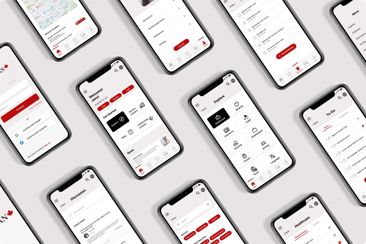
The high-fidelity prototype followed the same user flow as the low-fidelity porotype while including additional screens to accommodate user needs observed after the usability study.
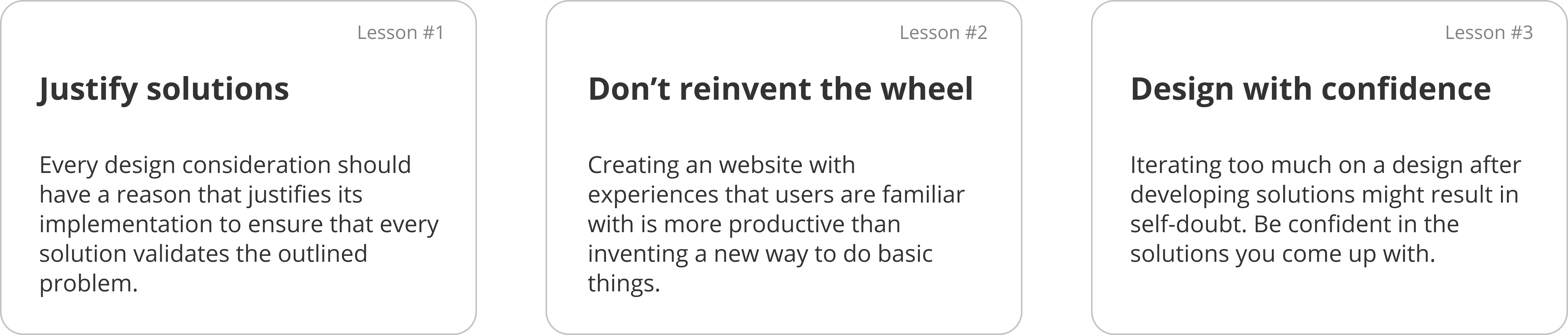
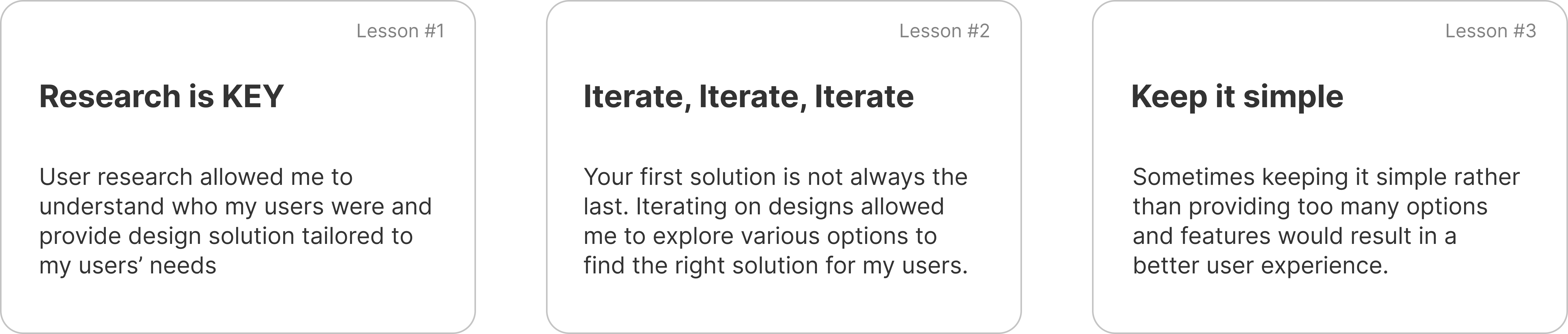
As I progressed, I realized that attending to particular user requirements at every phase of the design process enabled me to devise solutions that were practical and valuable.

%402x.svg)